Pages

Showing posts with label abstract artist. Show all posts

July 18, 2011

Donations Of Paintings Go To Hospice Abstract Hydrangeas

Club 47 #14
5x7 oil on panel.
Available $47, Click Here to Purchase. 
$4.70 will be donated to Hospice of Helena MT.

Florals may be the most challenging subject to paint in my opinion! In the morning and evening light flowers always have a transparent glow that is so difficult to capture. In this particular case there are hundreds of tiny petals that make up the hydrangea yet they are so soft in texture. Not to mention the depth in color of what we sometimes see as just a blue flower. There is gray, gold, blue green, gray blue green, purple, violet....ect.  So how do I convey so many colors in such a small subject and maintain a soft texture and a warm light? Honestly, I have no idea! All I can do is try, try and try again. 

I do love the colors in this painting and how it makes me feel when I look at it...
Bold, Energetic and Feminine!

or email me here.

July 17, 2011

Art for Charity Painting Proceeds to Benefit Hospice

Club 47 #13
5x7, oil on  panel. 
$47 Available, Click Here.

Just behind this grassy dune is the Atlantic Ocean. I love the dunes of Seabrook Island, SC they are full of thick vegetation and wildlife it is a spectacular site before stepping over to the ocean.

June 28, 2011

Abstract Landscape Paintings Support Hospice

Club 47 #5
5x7", oil on panel
Available for purchase, click here.


Club 47 #4
5x7", oil on panel
Available for purchase, click here.

Part of this challenge is to really explore color within my paintings. I am preparing for my next series titled "Spirit Places" and want to make sure I stay consistent in color when it comes time to paint these landscapes larger. I am focusing on a more neutral color palette which allows me to bring in many different grays. What may look gray and blah on my palette appears purple and warm in a painting. This is by far the hardest part of painting is creating color and knowing when and where to use it. There are things I love about these paintings and things I cannot wait to change once painting on a larger scale. It will be fun to see the comparison in the end. 

You can support Hospice by purchasing one of my Club 47 paintings! To learn more about the Hospice chapter please visit https://www.stpetes.org/hospital/home-health-care/hospice

You can see more of my work at www.marissavogl.com or follow me on facebook.

May 20, 2011

Artist Sally King Benedict


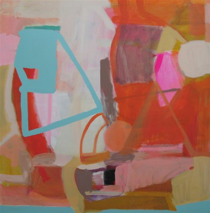
Last night I attended a show for contemporary artist Sally King Benedict titled COLORSPLASH. Her work is playful and her color pallete was fresh and airy. Myself and everyone else seemed to be in such good spirits among her work as you can't help but to feel comfortable and relaxed when in a room of Sally's paintings.


Tea Party 
48x48, mixed media

You can see more of Sally's work at www.sallybenedict.com


May 9, 2011

Please Vote for painting by Marissa Vogl

H&M clothing company is hosting a t-shirt contest! Please help me win by voting here. http://www.yourarthere.com/entry/almost-gone/

This painting has recently won awards with Contemporary Fine Art International's monthly challenge. What did I win? I am this month's featured artist which is huge in my world and in the world of art considering there are thousands of members who are artists. I am so honored and excited!

"Almost Gone"
18x24, oil on canvas.

May 4, 2011

A slight change in direction!

As I struggle to embrace blogging, yet I want to so badly...I have decided that I need to use this as a full creative journal! Yippeee! I am going to share with you more detail of who I am, what inspires me and things that bring me joy. So here we go! We recently built a home (my first time as a homeowner). I am so anxious to have it decorated floor to ceiling in a matter of minutes however we all know it is a journey and not a a product of a magical wand. You would also think that because I am a creative soul this would be an easy task...NOT TRUE! I love so many colors, styles, fabrics, surfaces, ect. that I am truly understanding why people hire interior designers, somebody to coral all of your ideas into one cohesive space. Anyway because I am who I am, I will be doing all of the decorating myself with my husband of course.

I have agonized for weeks, maybe even months over fabric for the dining room and breakfast nook. After late nights and seriously frustrating my husband I threw caution to the wind and picked one. My fabric of choice is Robert Allen's, Kiki / Azure www.robertallendesign.com. This fabric will hopefully be my guiding light for other design decisions to come. I guess I should mention what style I am going for. I described it to a friend of mine like this.... An elegant, rustic, spanish, modern disaster. Lets just hope the word disaster ends up being replaced with something more appealing. I think it could be fantastic! Now if I can keep the eclectic bohemian in me from overrunning my project!


Robert Allen Fabric: Kiki, Azure

April 15, 2011

Red Apple Study I

'Red Apple Study I'
5x7", oil on panel.

'Red Apple Study II'
8x10", oil on canvas.

I have had a challenging time mastering the color red. This apple study allowed me to play with the mixing of different shades and values of red to achieve that brightness that anything red and shiny gives off. I still have a bit of learning to do but for the time being I am pretty happy with the results. What did I learn....well I now know that I need to start out with pure red pigment as my highlights or brightest shade of red from there I just need to mix darker shades and add shadows of reds to allow the pure pigment to pop.